Web App
Llama ID
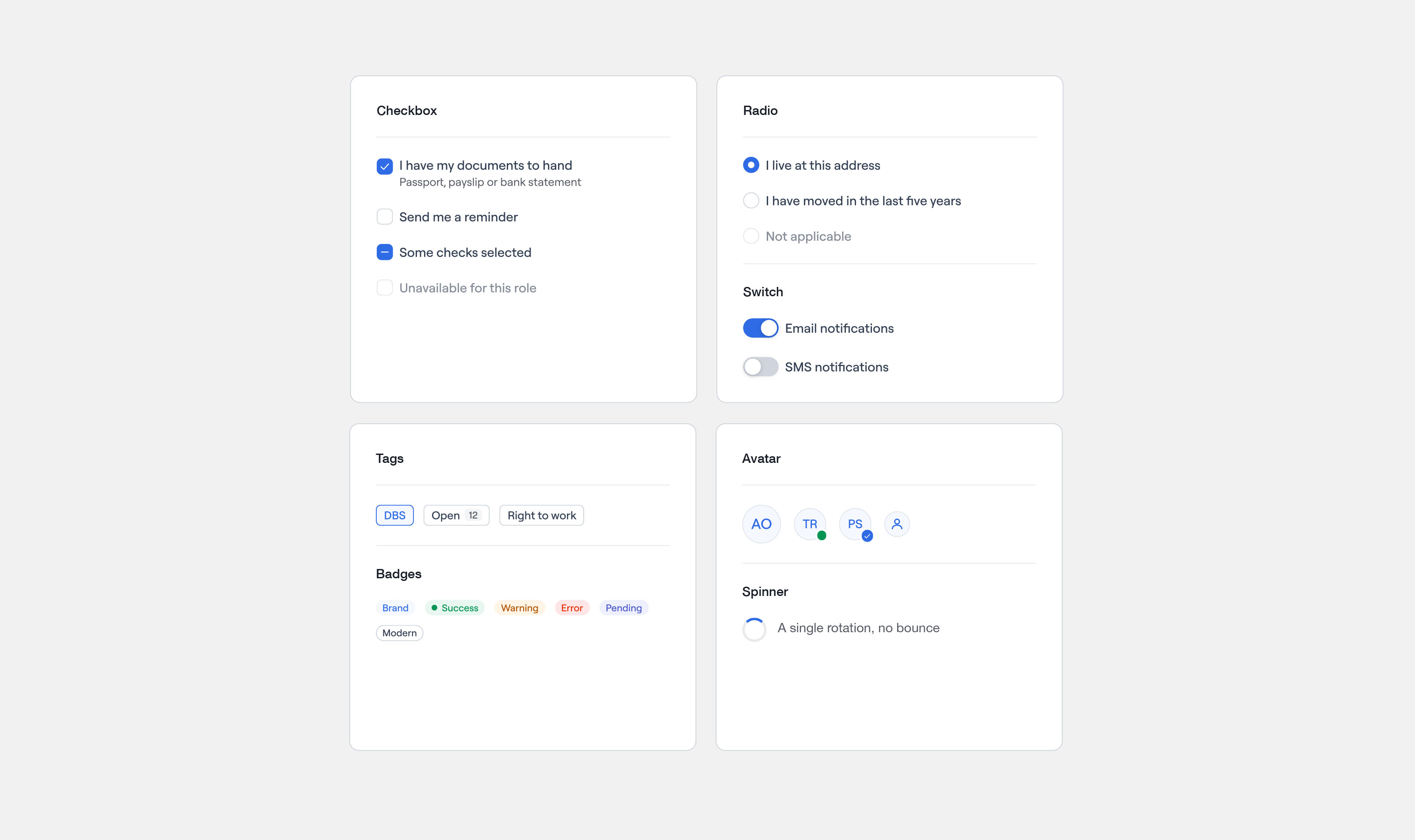
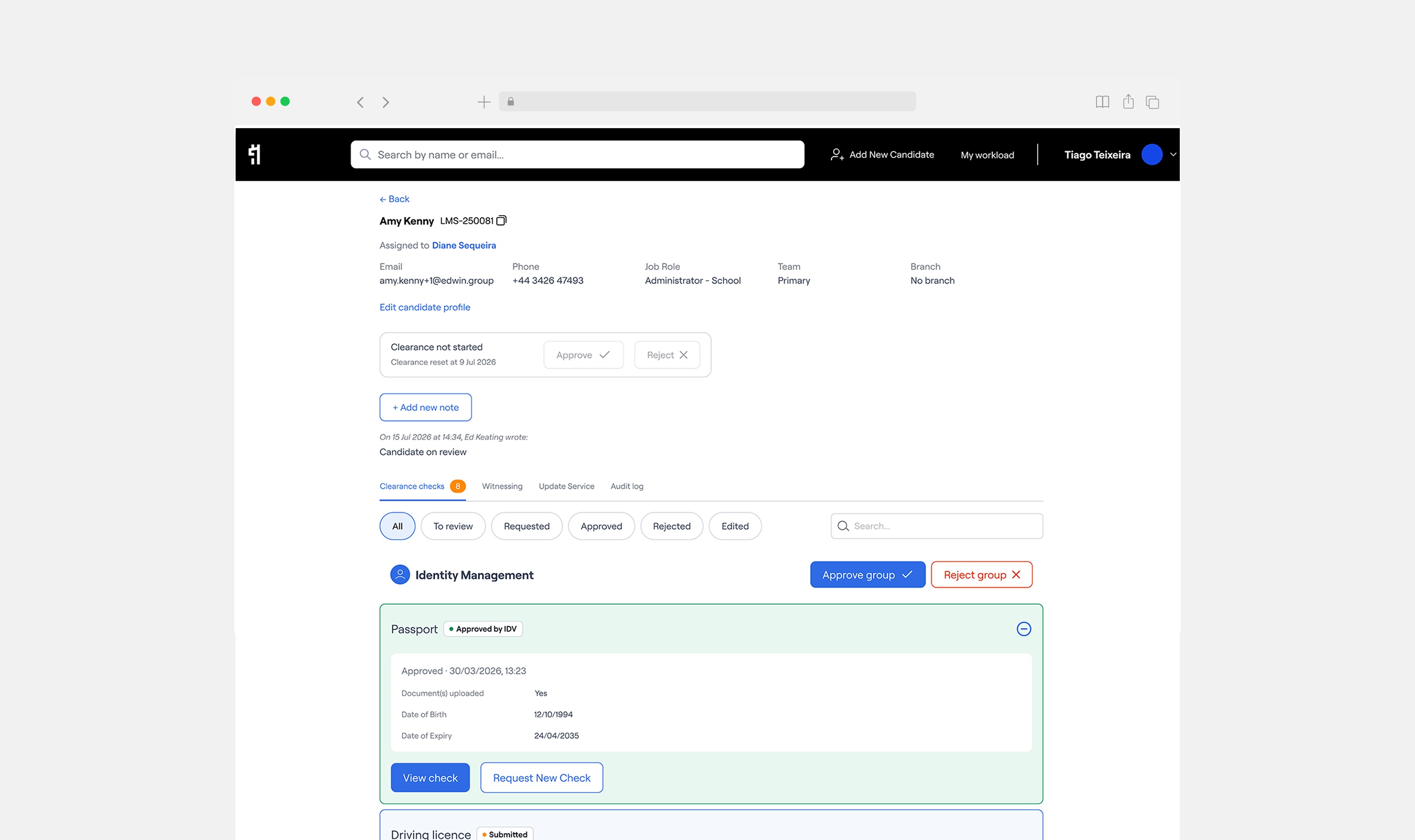
Using leading-edge technology, Llama consolidates the entire safeguarding and vetting process into a single, unified environment, removing the need for schools and MATs to manage checks across separate systems, spreadsheets, and email threads. Edwin engaged me as Lead Product Designer to redesign the platform from the ground up, addressing years of accumulated UX debt and preparing Llama for a significant expansion of its user base. This is how we updated the Llama platform into a lean, friendly experience for candidates and consultants.
Impacts and outcomes
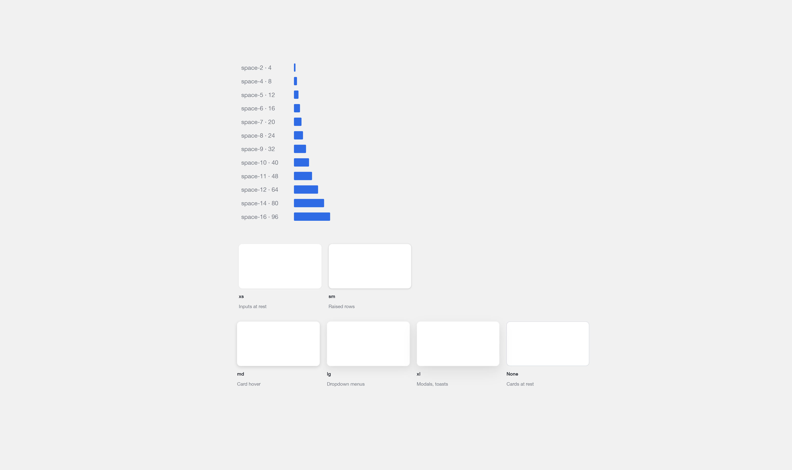
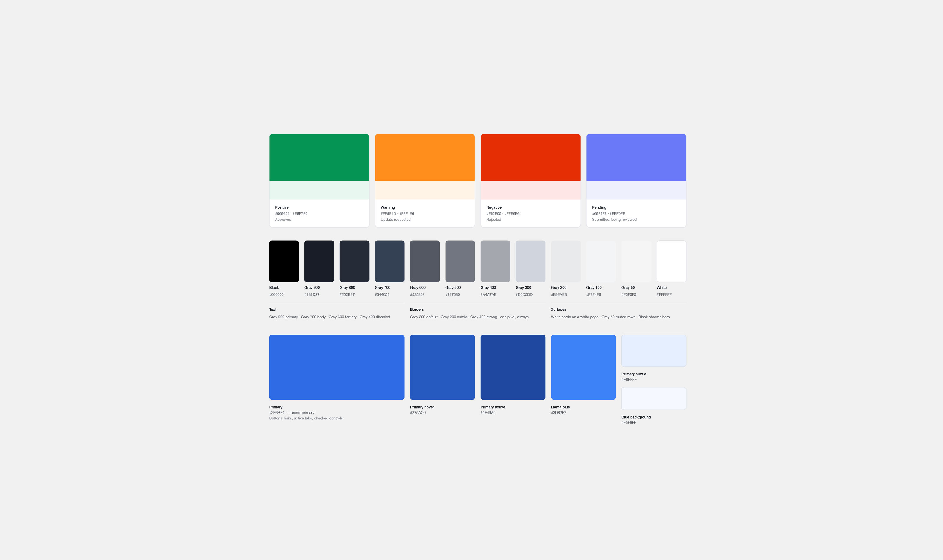
- Redesigned automated pre-employment checks, cutting clearance time from 21 to 8 days and scaling to 20,000 candidates annually. Integrated Edwin Verify to eliminate third-party DBS countersigning and support external education customers. Delivered an adopted design system across candidate, consultant and business platforms, using AI-assisted workflows to accelerate research, prototyping and development while establishing scalable UX foundations.
21→8
Days to candidate clearance
20k+
Candidates cleared per year
2
Products designed end-to-end
4mo
Discovery to delivery
Problem
Safeguarding checks are time-sensitive and high-stakes. Schools cannot put candidates in front of children without clearance, and delays cost everyone. The Llama platform was slowing that process down. Candidates could not easily follow where they were in the process. Consultants had to manage applications through an interface that gave them a poor picture of their caseload. And underneath all of it, a back-end connected to several distinct third-party servers made the product fragile and hard to improve.
Investigation
We began by mapping the existing candidate and consultant journeys in detail, identifying where the process broke down and why. The candidate side had the most friction. The steps required to complete a DBS application were not explained clearly, documents were requested without context, and there was no feedback when something had been received or was being processed. Consultants, meanwhile, were working from a flat list of applications with no way to sort by urgency or status. Research confirmed that most support queries from candidates were questions the platform should have answered on its own.
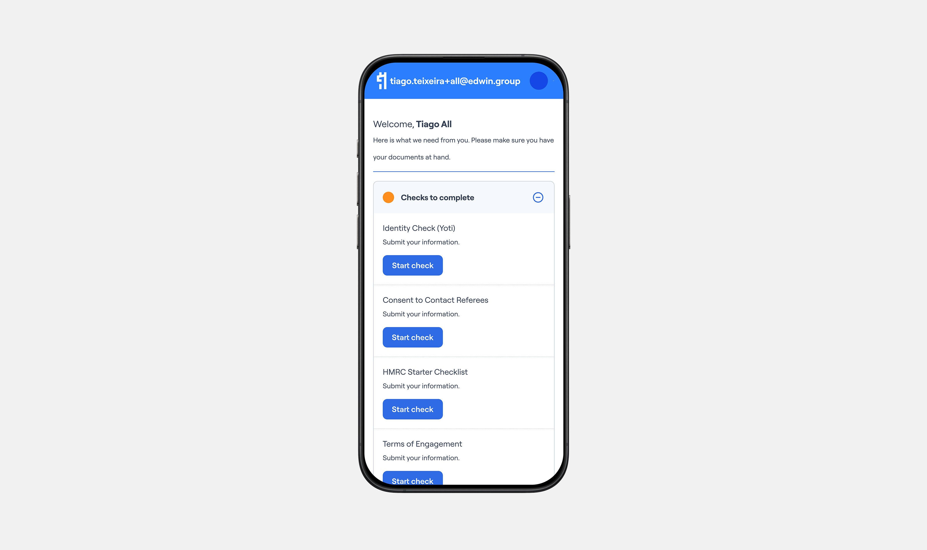
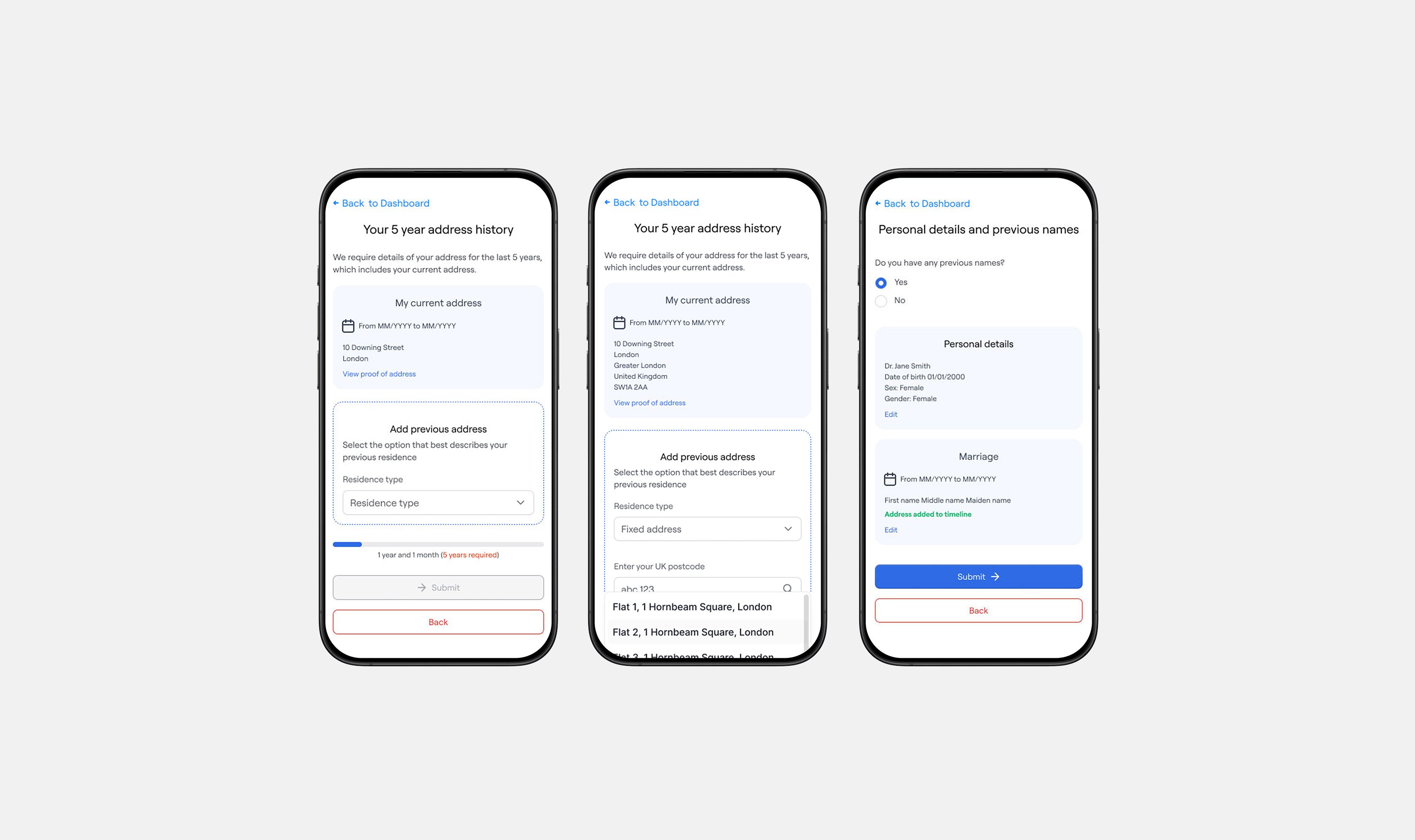
The back-end complexity shaped every design decision. Before touching the interface, we worked with engineering to understand what data was reliably available and where gaps or delays came from third-party dependencies. That determined what we could show candidates in real time and what had to be handled with clear holding states instead. Over four months, I designed and refined both web applications: the candidate-facing product built around task completion and progress clarity, and the consultant-facing product built around caseload visibility and fast action.
Insight
Candidates and consultants do different jobs, so one design could not serve both. Candidates need to see the whole shape of their journey and know who is holding things up. Consultants need to scan and act quickly, not be guided step by step.
Solution
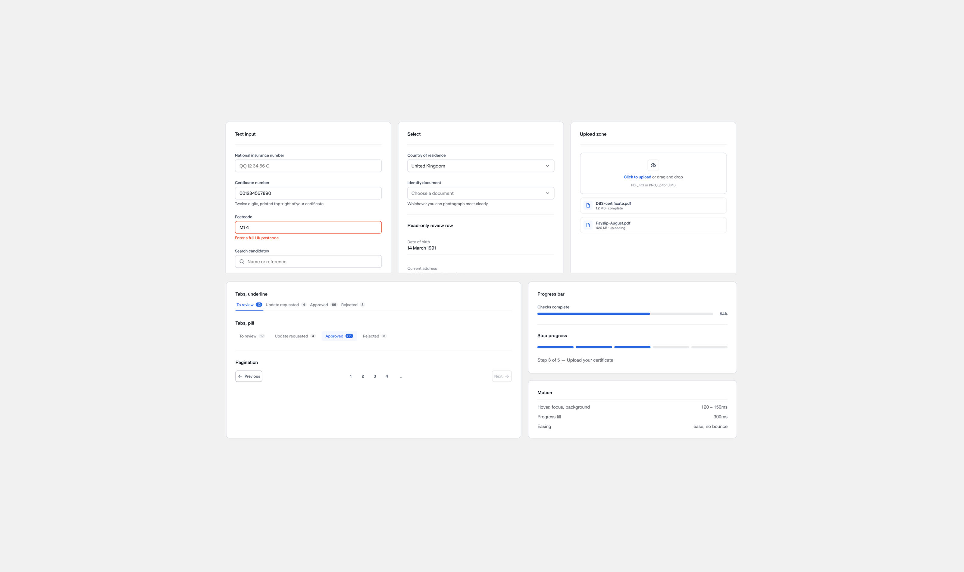
I split the redesign into two related applications. In the candidate portal, I built a persistent progress architecture. At every point, candidates can see which stages are complete, which are in progress and which are waiting on external parties, not on them. For the consultant platform, I rebuilt the main workspace around a configurable table view with filtering, sorting and status-based grouping. Both feel calm, professional and clear.