Design System
Edwin Digital Brand
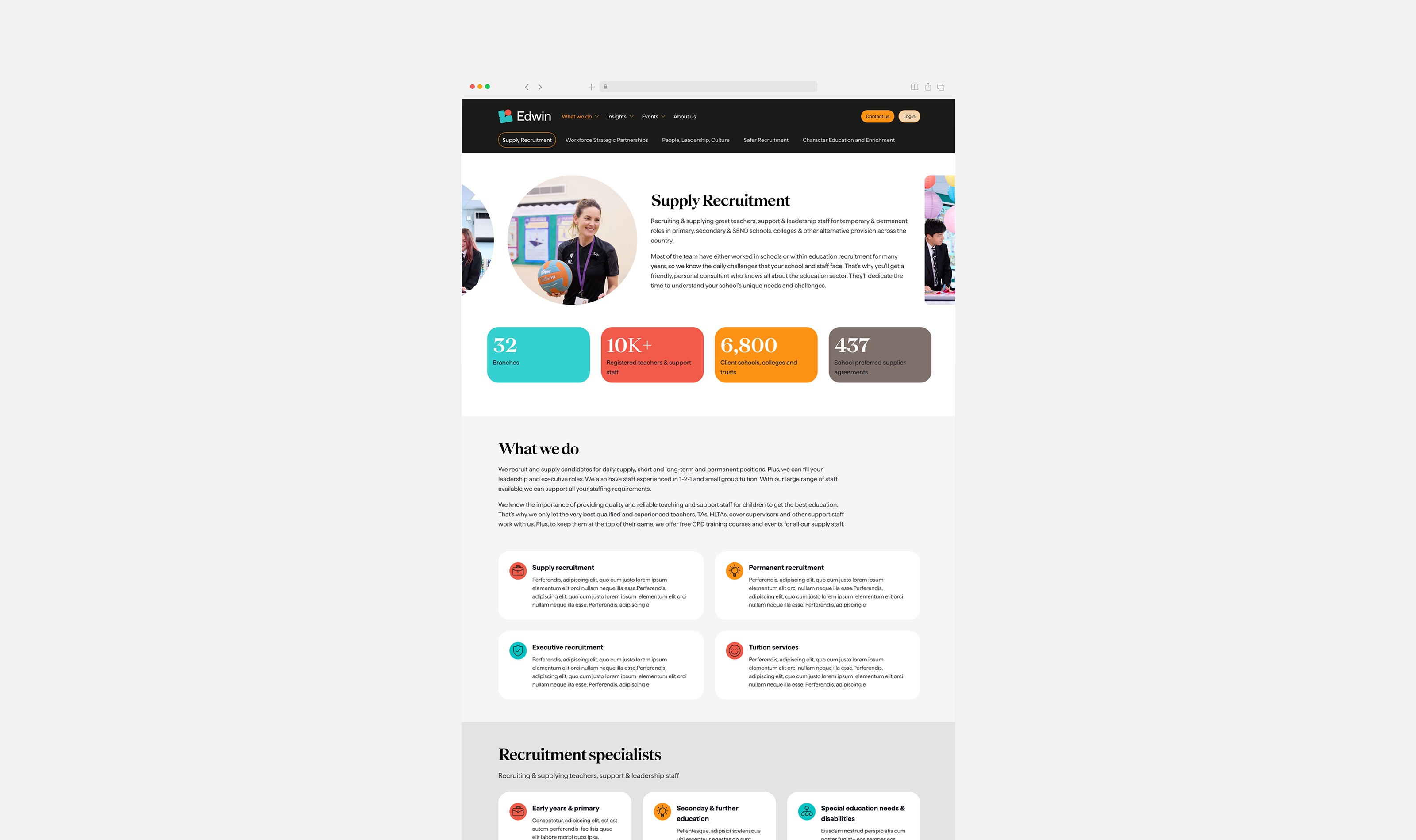
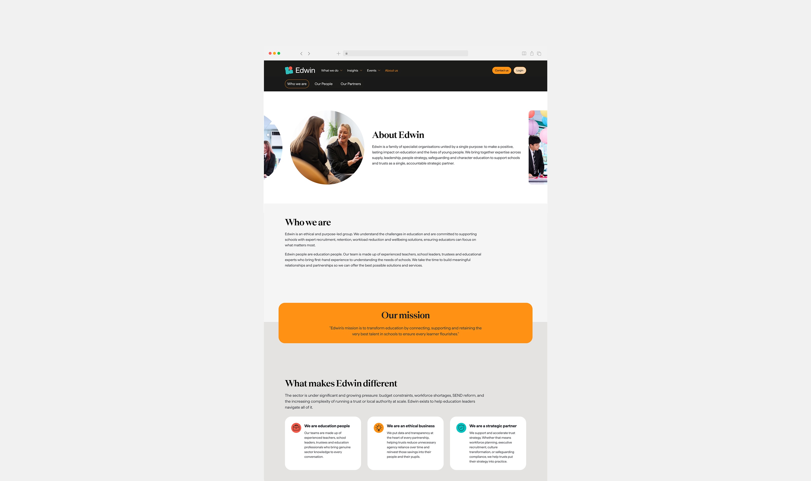
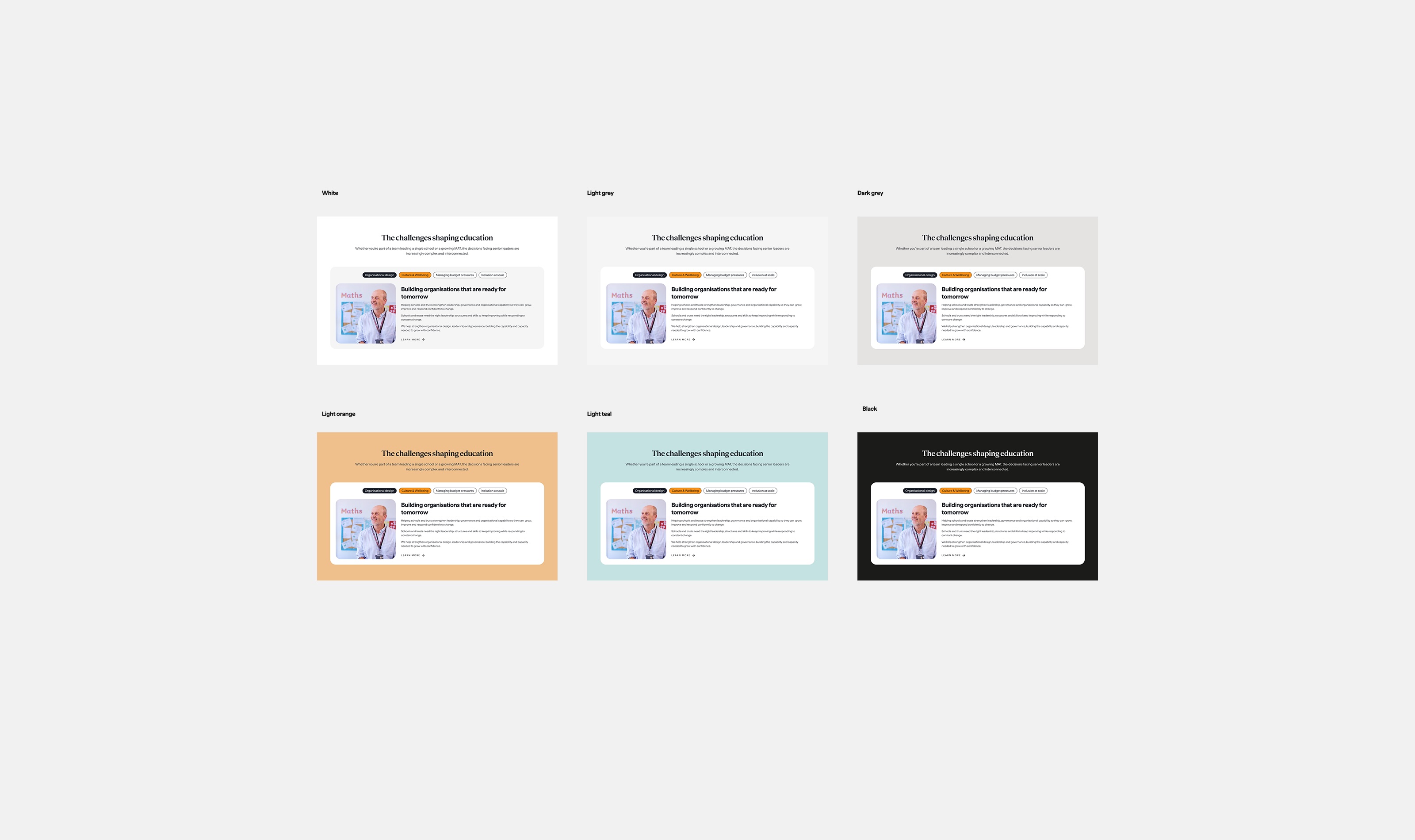
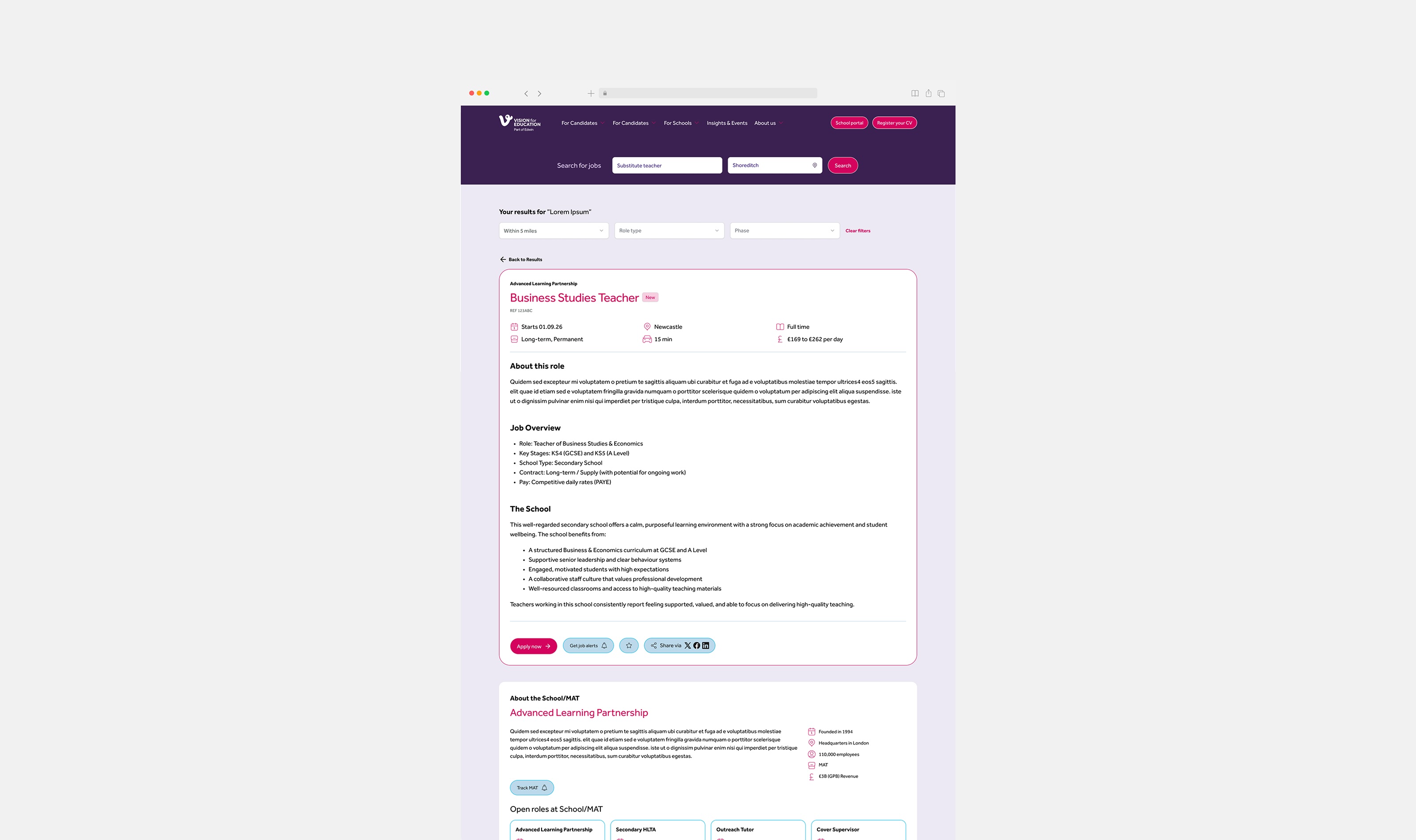
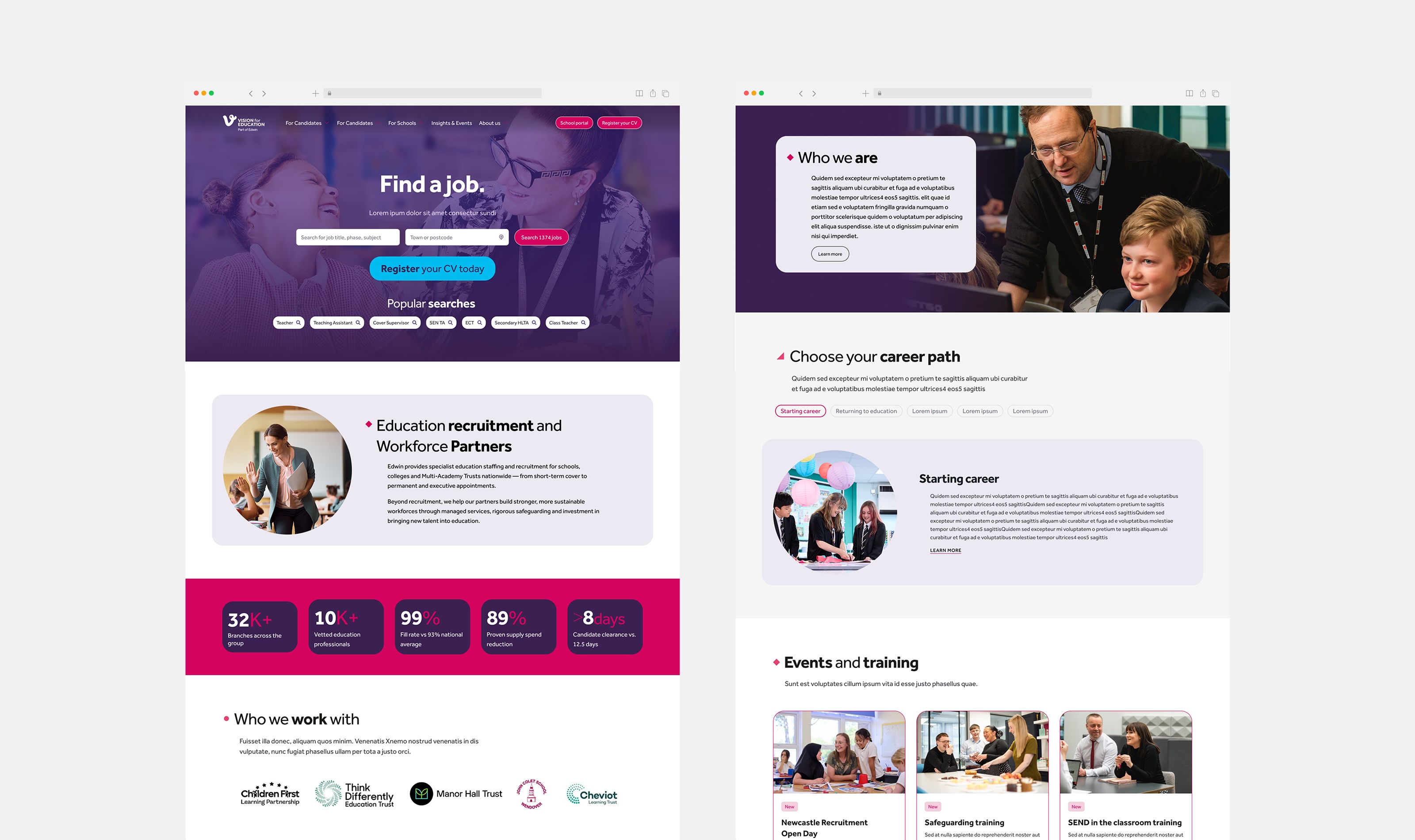
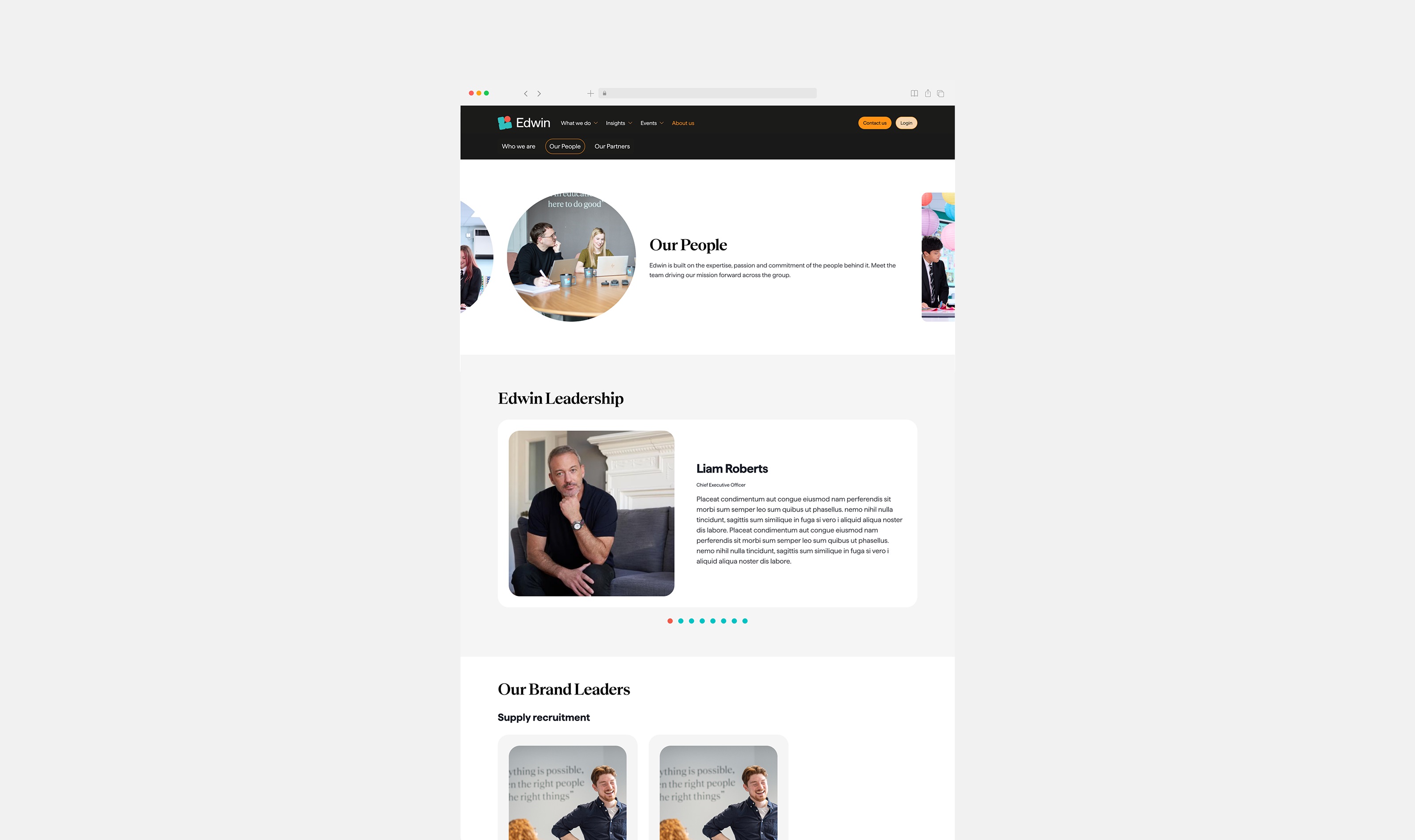
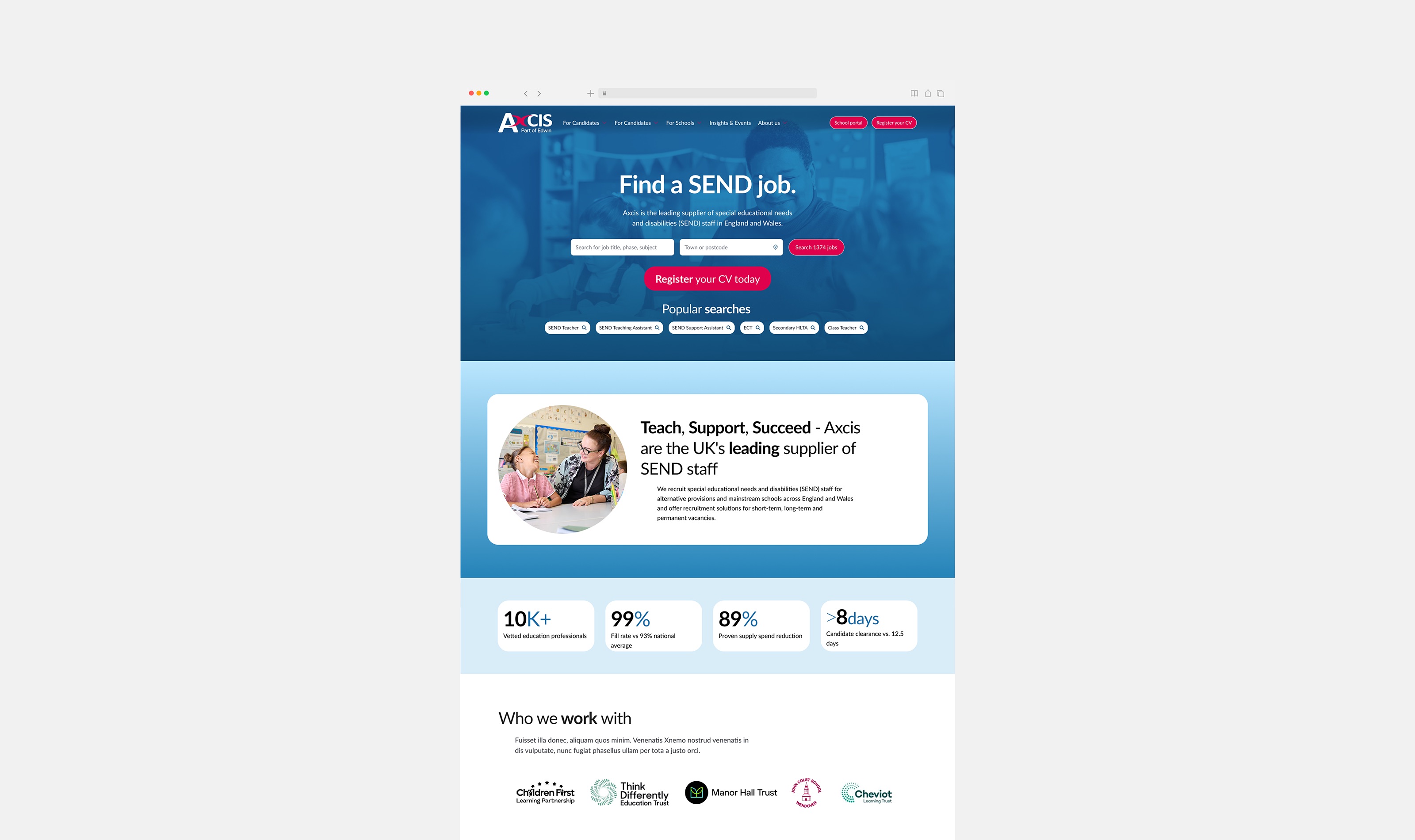
The Edwin Group brand was weakened by the varying permutations accross several brand sites and services, making it difficult to their users to identify them. I've created a design system that was used through multiple sites, with minor variations. The design was flexible enough to be applied to wildly different brand guidelines while making them feel like they were connected to each other.
Impacts and outcomes
- Unified design system adopted across 5 brand websites within the Edwin Group.
- Component library and CMS implementation sped up updates and reduced developers workload.
- Brand recognition scores improved across user testing sessions.
- AI-integrated guidelines, tutorials and examples allowed non-technical editors to preview and apply components in real time.
- Consistent visual language established across wildly different brand guidelines.
5
Brand sites on one design system
↑
Brand recognition in user testing
AI-first
SEO-friendly architecture
1
Unified component library
Problem
Edwin Group supports schools with recruitment, retention, workload reduction and wellbeing. The old website said little about the Group's expertise, brands and overall offer. That confused prospective clients and made lead generation harder. It also made weak use of the established brand guidelines. Technically, its JavaScript-heavy build limited search engine optimisation and reduced visibility in AI-powered search and discovery.
Investigation
We looked at the site from three angles: what it told prospective clients, how it used the brand and how it was built.
Insight
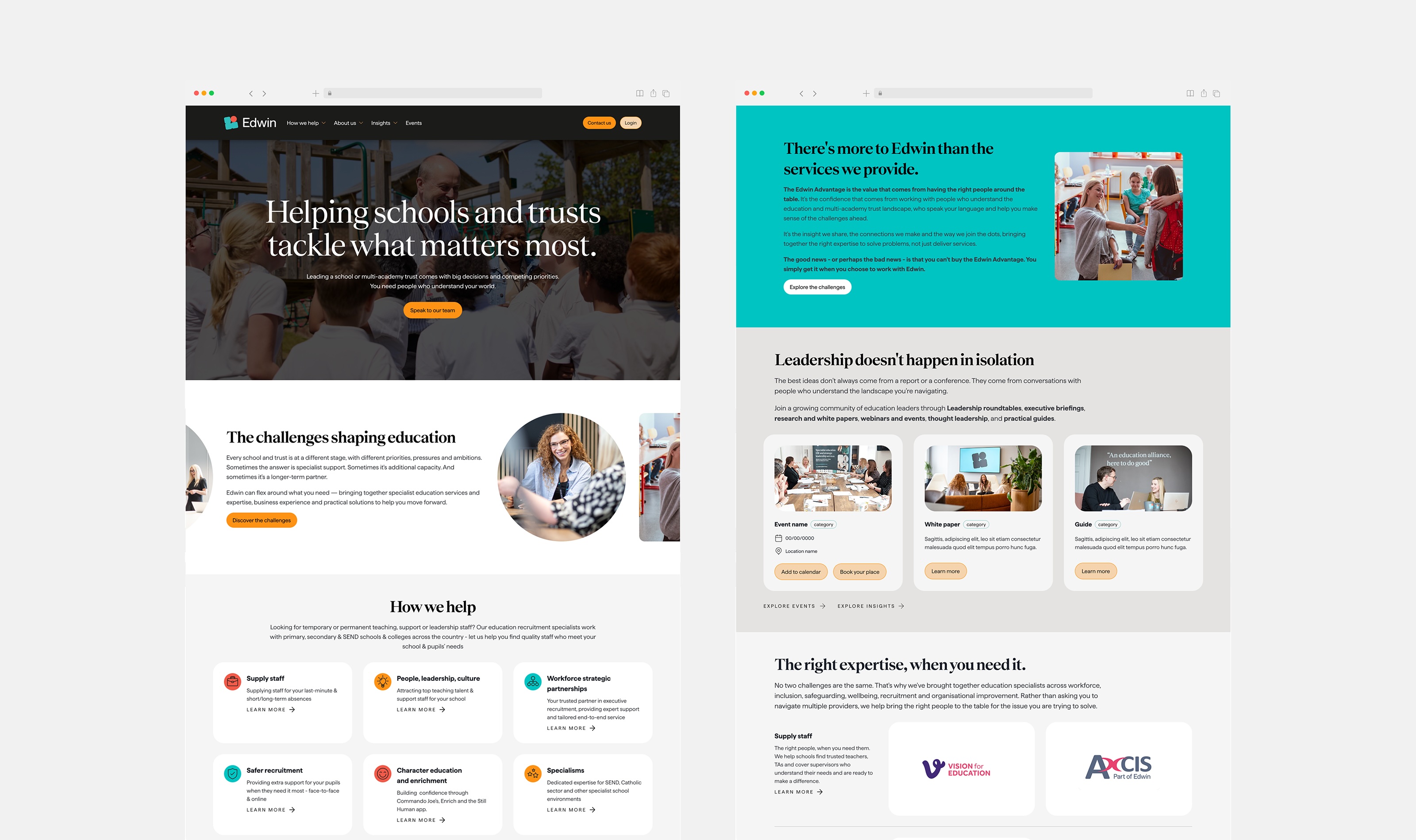
Clarity and discoverability were one problem, not two. A site that explains a family of brands badly is hard for people to understand. A site built on a heavy architecture is hard for search and AI tools to read. Both needed fixing together.
Solution
We rebuilt the site on an AI- and SEO-friendly architecture. It presents the company, its capabilities and its portfolio of brands clearly, without overwhelming the visitor. Proof points sit up front. Connections to the Group's other service sites make the journey feel cohesive. The design makes bolder use of the existing brand guidelines. Navigation is intuitive, content is bookmarkable and the site is fully responsive. Photography and copy were curated to reflect the company's tone of voice.