Website + Design System
Aviva
I spent 6 years at Aviva, working with complex user journeys and designs systems.
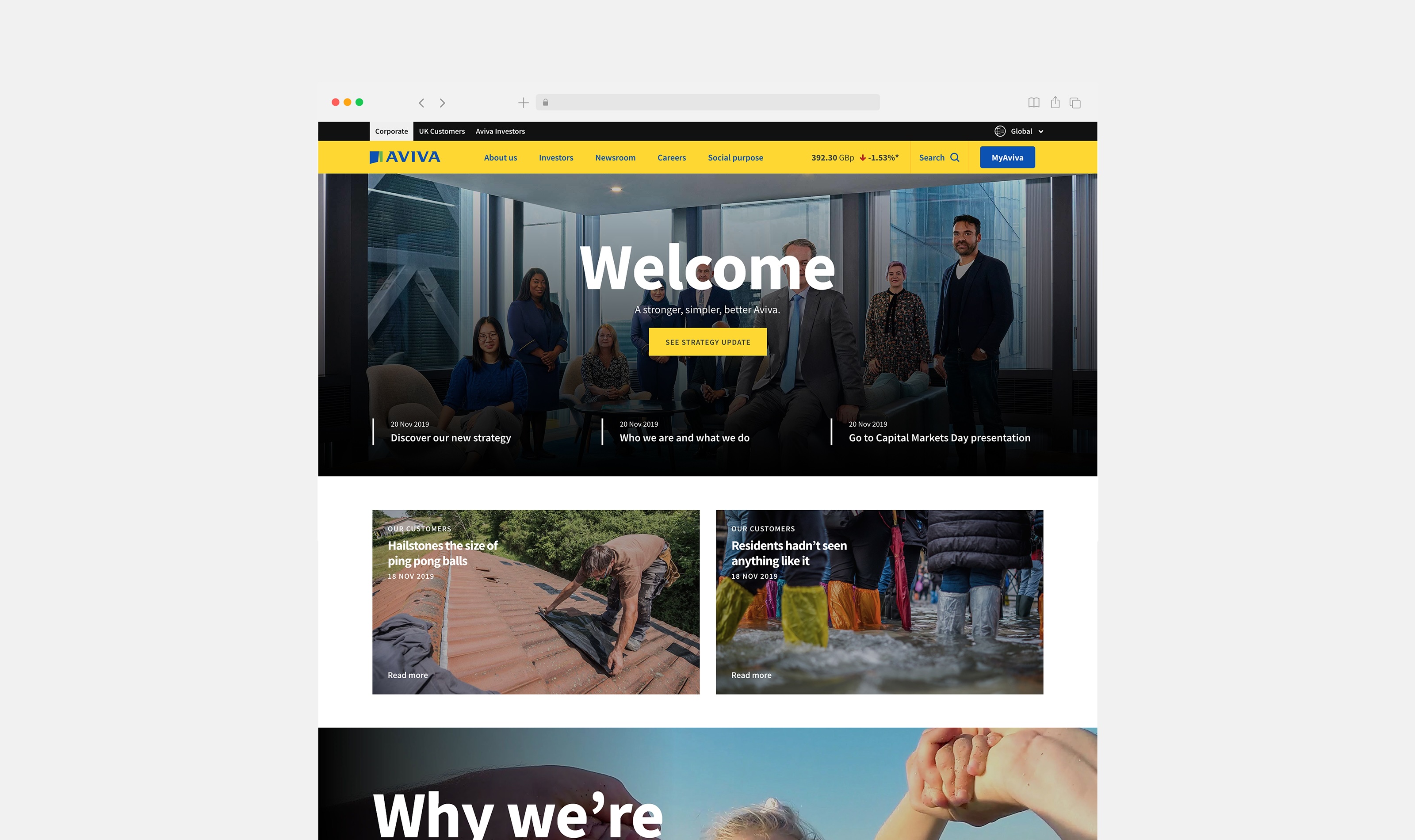
Impacts and outcomes
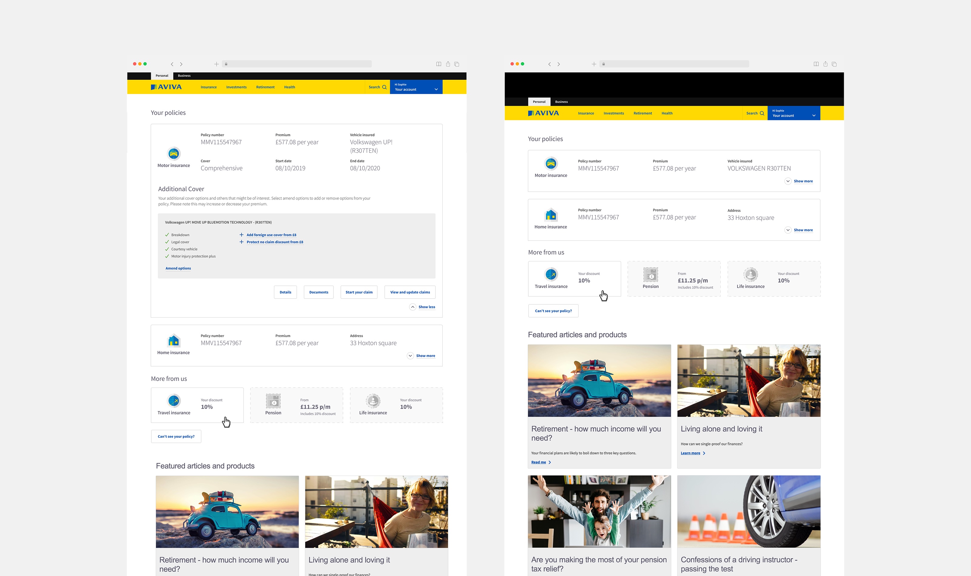
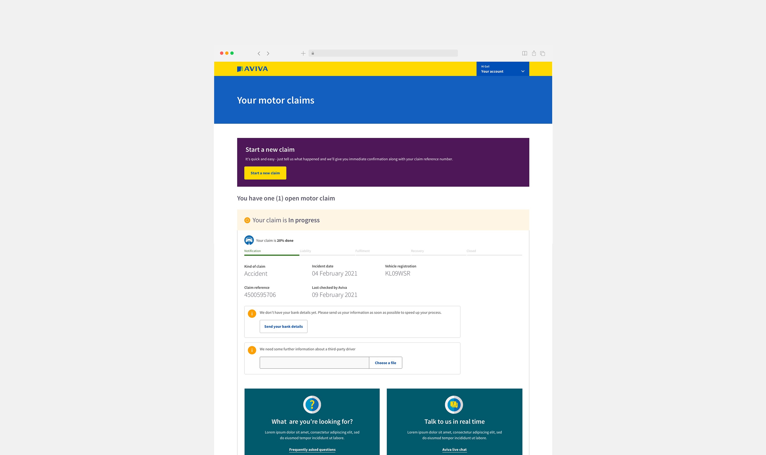
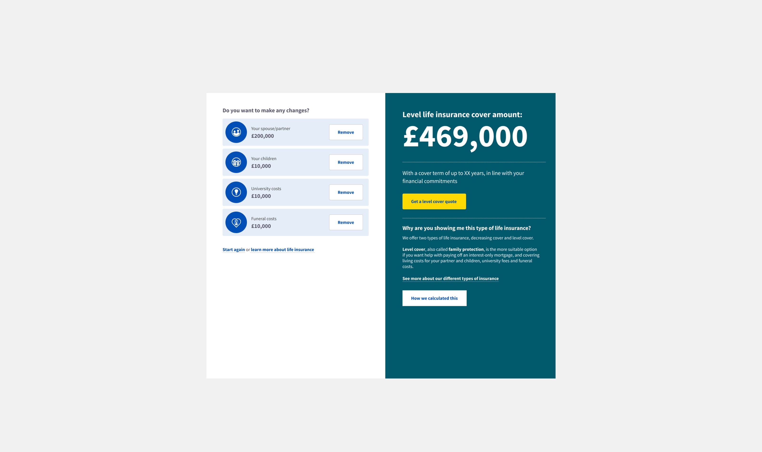
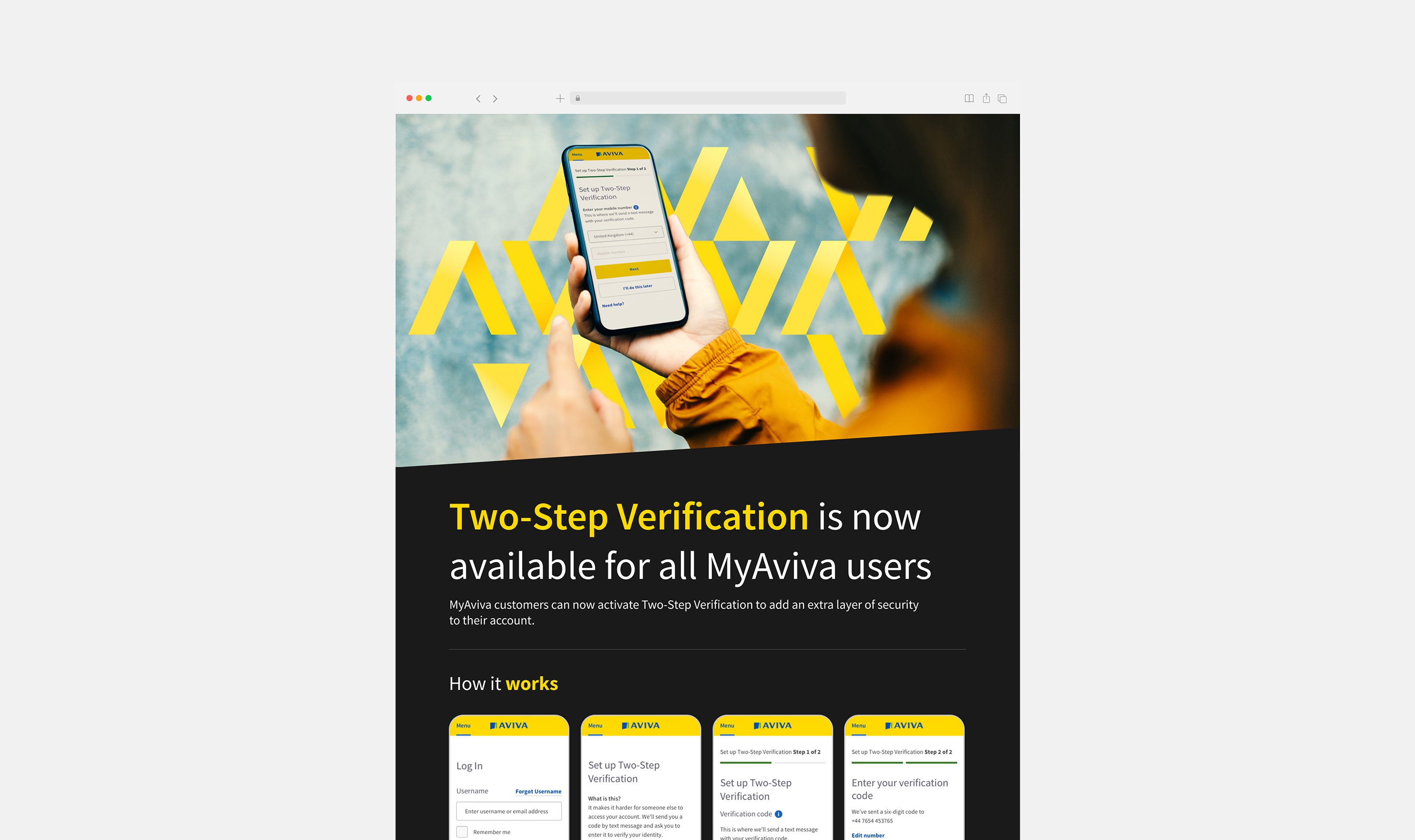
- Redesigned the MyAviva dashboard, replacing legacy components with a streamlined, accessible experience, and established a distinct visual identity for Aviva.com. Improved brand and product recognition, raised accessibility and usability standards across product lines, and reduced inconsistencies through shared design systems adopted by parallel teams.
Problem
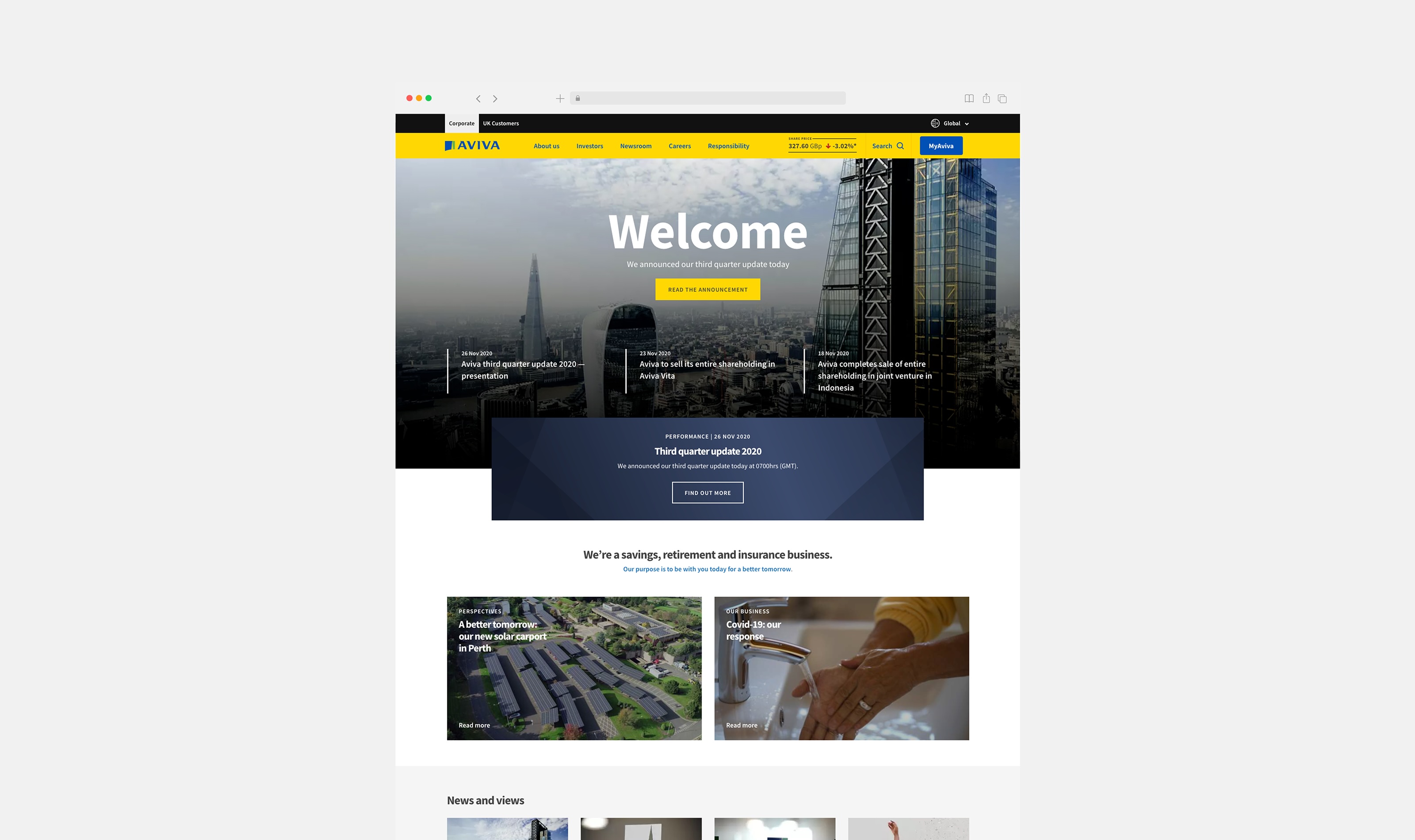
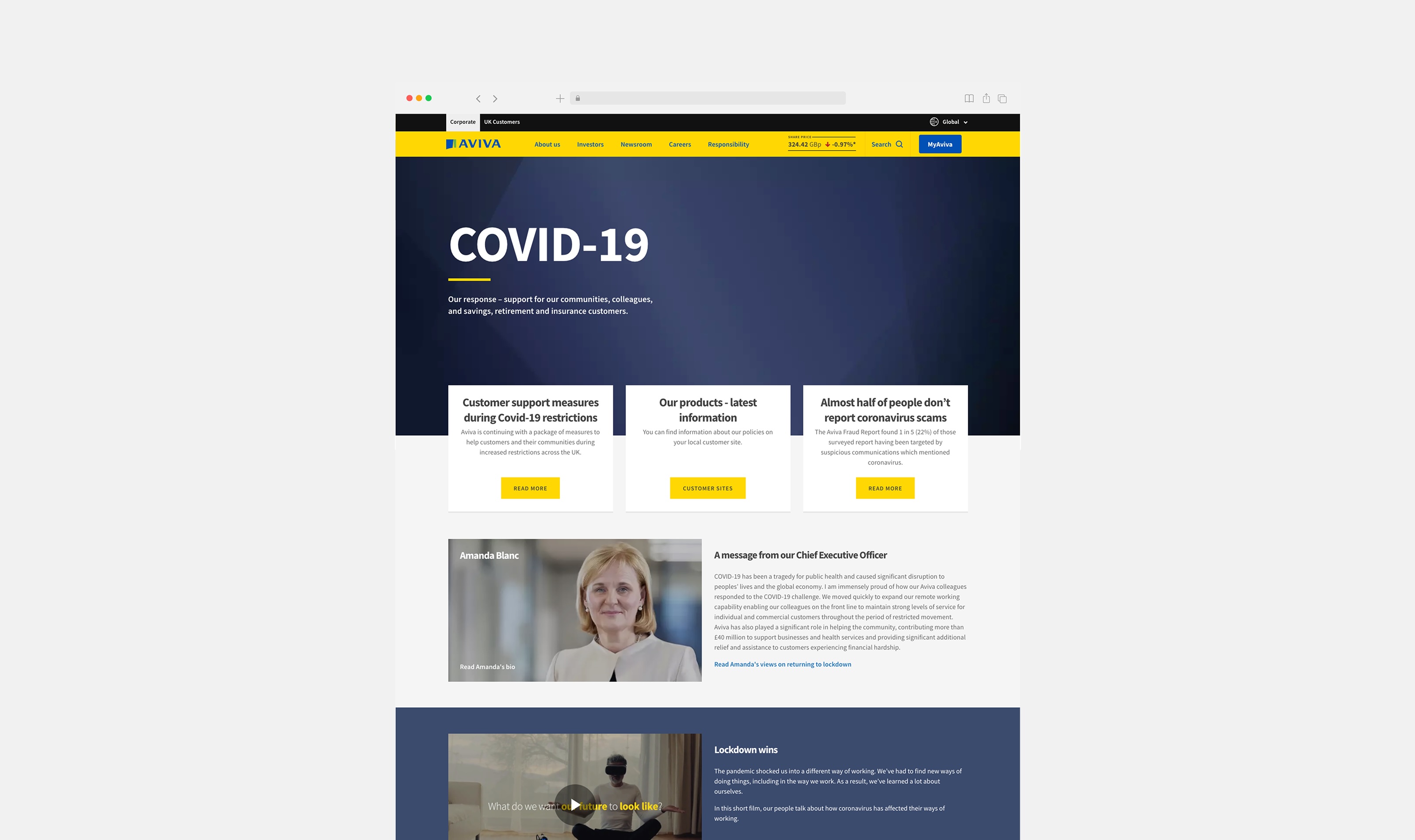
Aviva is one of the UK's largest insurers, serving over 18 million customers. Aviva.com is its corporate site, built for institutional investors, analysts, journalists and board-level stakeholders. It had to convey financial performance, governance, strategy and corporate responsibility to a sophisticated audience. But internal teams and external users kept confusing it with the consumer site, Aviva.co.uk. It had no coherent design system. People saw it as generic and low-value. Its taxonomy and content categories were out of date.
Investigation
I audited corporate websites across the FTSE 100 and international insurers including Allianz, Zurich and AXA. The audit mapped visual identity, information architecture, content strategy and tone of voice against what users expect from corporate communications.
Insight
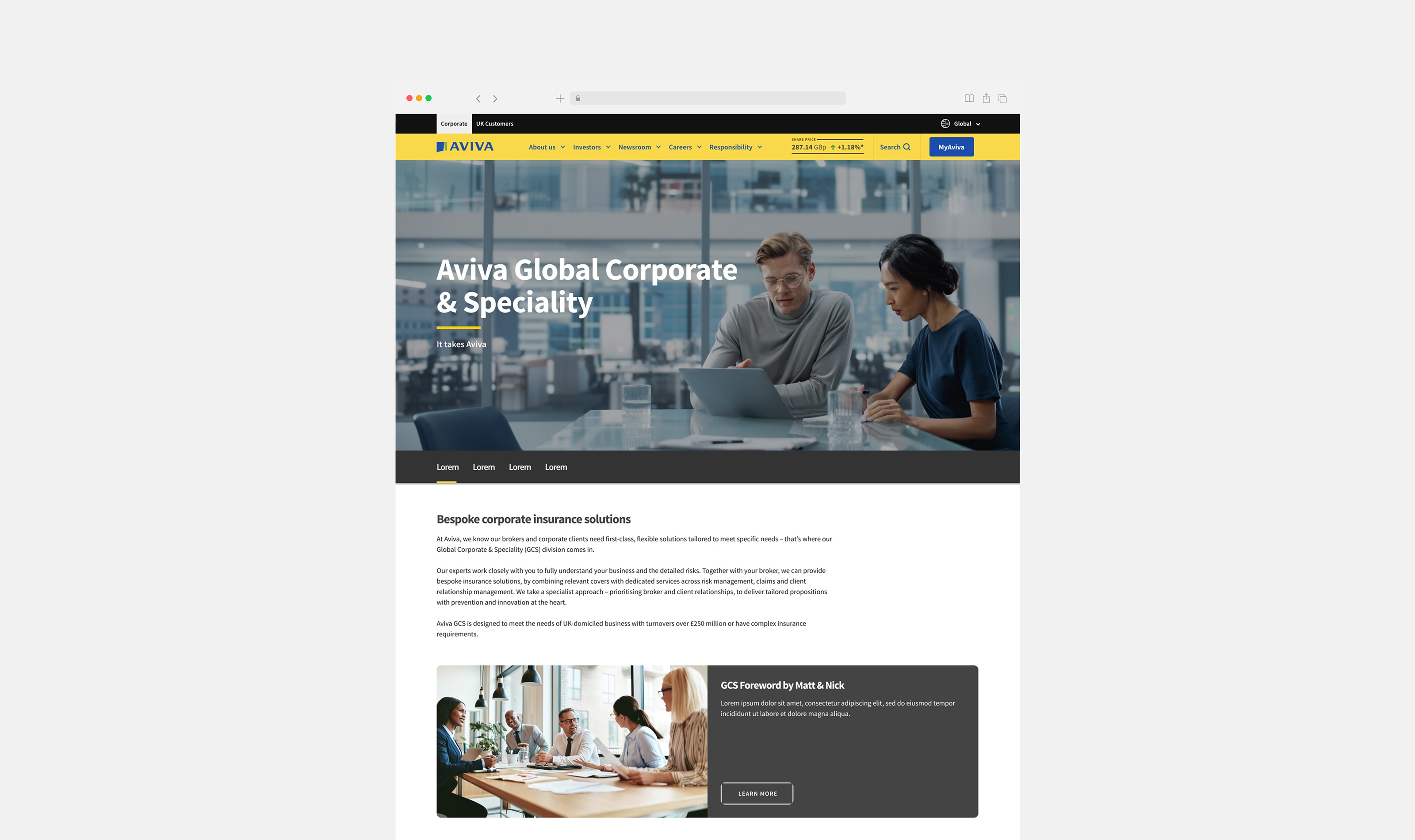
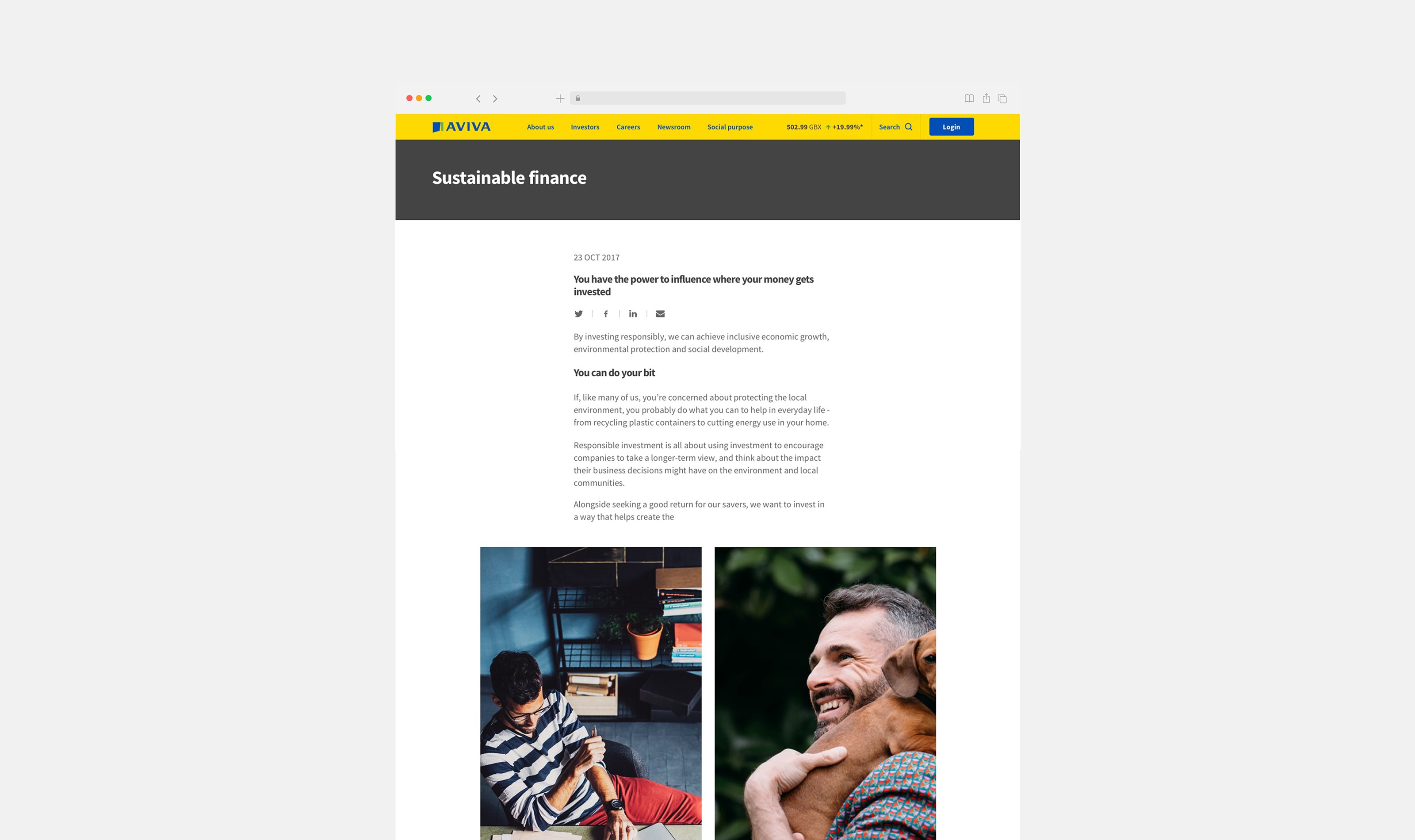
The most trusted corporate sites in the sector used restrained, typographically led design systems. Their identities deliberately diverged from their consumer brands. That became the founding principle of the project: Aviva.com should look and behave differently from Aviva.co.uk, on purpose.
Solution
I created a design system unique to Aviva.com, different in form and purpose from the consumer site. We reviewed the taxonomy and content hierarchy from top to bottom so people could reach what they need faster. The new components are modular and flexible, and the system can serve many purposes across the site. The final design phase ran four months. I worked closely with a front-end developer and a content strategist to move from high-fidelity prototypes to a fully implemented, responsive site. Weekly design reviews with the investor relations director and the head of digital kept everyone aligned.